Roughly 80 percent of the global workforce does not sit at a desk, and most training platforms were designed for people who do. Mobile learning that works for frontline teams requires responsive design tested on real phones, offline access for poor-connectivity environments, short units that fit a break rather than a block, and completion tracking that works identically on mobile.
Most 'mobile-friendly' training is not
Nearly every LMS in the market claims mobile support. In practice, what most deliver is a desktop interface rendered on a smaller screen, which means text that requires zooming, interactions that do not work by touch, and assessments that time out on unreliable connections.
For office workers who occasionally check training on a phone, that is tolerable. For the roughly 2.7 billion deskless workers worldwide, including retail staff, manufacturing operators, field technicians, healthcare workers and logistics teams, it means the platform functionally does not work where they work.
So mobile learning for frontline teams is not a feature toggle. It is a design decision that affects content length, interaction design, connectivity handling and completion tracking.
What mobile learning actually requires
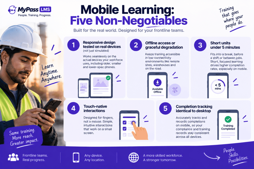
- Responsive design tested on the actual devices your workforce uses, not on the latest phone in a simulator. Frontline devices are often older, smaller and slower than what the development team tested on.
- Offline access or graceful degradation. Warehouses, construction sites, rural healthcare facilities and delivery routes all have connectivity gaps. If the platform requires a constant connection, it excludes the environments where mobile learning matters most.
- Short units. A frontline worker's available training window is the time before a shift, a break, or transit between locations. Industry data shows microlearning under 5 minutes completing at 60-82 percent versus 17-25 percent for 30-60 minute modules, and that gap widens substantially on mobile.
- Touch-native interactions. Drag-and-drop designed for a mouse does not work on a phone. Hotspot activities with small targets frustrate rather than teach. If an interaction requires precision pointing, it was designed for desktop and pushed to mobile.
- Completion tracking identical to desktop. A completion that registers on desktop but not on mobile, or vice versa, corrupts compliance records. This is a specific failure mode, not a theoretical one, and it is worth testing explicitly during evaluation.
The shared-device problem nobody talks about
A substantial share of frontline workers do not have company-issued devices and do not want to install their employer's apps on personal phones. Shared devices in break rooms, kiosks on factory floors and tablets at nursing stations are common, and they break the assumption most platforms make about one device per person.
- Login must be fast. If logging in takes more than a few seconds, the next person in line will not wait. QR code or PIN-based access is substantially faster than email-and-password.
- Sessions must not persist. If the previous user's session stays logged in, the next user's completion is attributed to the wrong person, which is a compliance problem disguised as a UX issue.
- Content must not cache personal data. On a shared device, anything that persists between sessions is visible to the next user.
| The evaluation test for shared devices: log in as User A, complete a module, log out. Log in as User B on the same device. Is User A's session gone? Is User B's progress clean? Do both completions appear correctly in the report? This takes five minutes to test and surfaces the problems that take months to discover in production. |
Designing content for a phone screen
Content that works on mobile is not desktop content made smaller. It is different content, or at least differently structured content:
- One concept per screen. Scrolling through dense text on a phone produces scanning, not reading.
- Video under 3 minutes. Attention on a phone is shorter than at a desk, and buffering on mobile connections makes long videos unreliable.
- Tap-based interactions rather than drag-based. Select, tap and swipe work. Drag-and-drop, small-target hotspots and text-entry interactions do not work well on touch screens.
- Visual-first where possible. Diagrams, images and infographics communicate faster than text on a small screen, and they transfer better across multilingual workforces.
- Vertical orientation. Most people hold their phone vertically. Content designed for landscape requires rotation, which is friction.
Where mobile learning matters most, and where it does not
- High value for mobile: safety briefings before a shift, product knowledge for retail staff, compliance refreshers, quick reference guides, field-procedure checklists, QR-triggered attendance for in-person sessions.
- Lower value for mobile: deep analytical courses, extended case studies, complex simulations, assessment-heavy certification programmes where a larger screen materially affects performance.
The practical approach is to deliver what works well on mobile via mobile, and not to force everything onto a phone screen in the name of mobile-first ideology. A safety refresher is perfect for mobile; a three-hour compliance course with complex scenarios is better on a tablet or desktop, and pretending otherwise reduces completion.
The bottom line
Mobile learning is not a feature. It is a design commitment that affects content structure, interaction design, connectivity handling and device assumptions. For frontline teams it is often the only channel that reaches where they work, which makes getting it right operationally important rather than aspirationally nice. Test on the actual devices your workforce uses, handle shared devices and offline access explicitly, keep units under five minutes, and design for touch and vertical orientation. Then deliver what works on mobile via mobile, and leave the rest for a larger screen.
MyPass LMS delivers responsive mobile access with QR-based attendance capture and completion tracking identical to desktop. See the platform features, or start a 15-day free trial.
Frequently asked questions
What is mobile learning?
Training delivered on smartphones and tablets, designed for the constraints of those devices: small screens, touch interaction, variable connectivity and short available time. For frontline teams it is often the primary or only training channel, not a secondary option.
Why does most mobile training fail for frontline workers?
Because most platforms render a desktop interface on a smaller screen rather than designing for mobile constraints. Text requires zooming, interactions do not work by touch, assessments time out on poor connections, and shared-device use is not considered.
What is the ideal length for mobile learning?
Under 5 minutes per unit. Industry data shows microlearning completing at 60 to 82 percent versus 17 to 25 percent for longer modules, and that gap widens on mobile where available time is shorter and distractions are greater.
How do you handle shared devices for training?
With fast login such as QR code or PIN, sessions that do not persist after logout, and no personal data cached between users. Test explicitly: log in as one user, complete training, log out, then log in as another and verify both records are clean.
Does mobile learning work offline?
Some platforms support offline access where content is downloaded in advance and completions sync when connectivity returns. For environments with unreliable connections, such as warehouses, construction sites and rural facilities, this is a requirement rather than a nice-to-have.